A Feature in Art Supplies by Uppercase
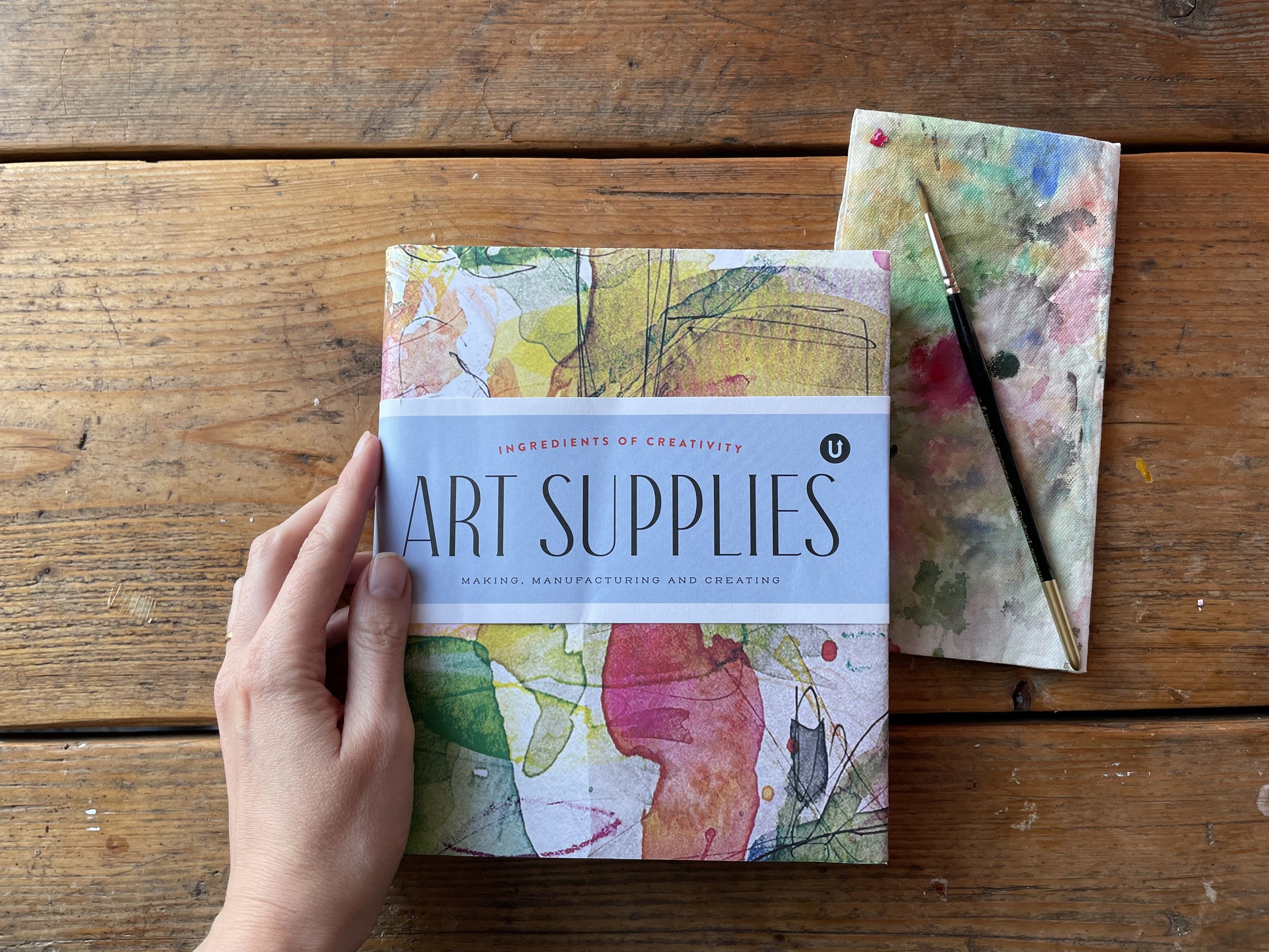
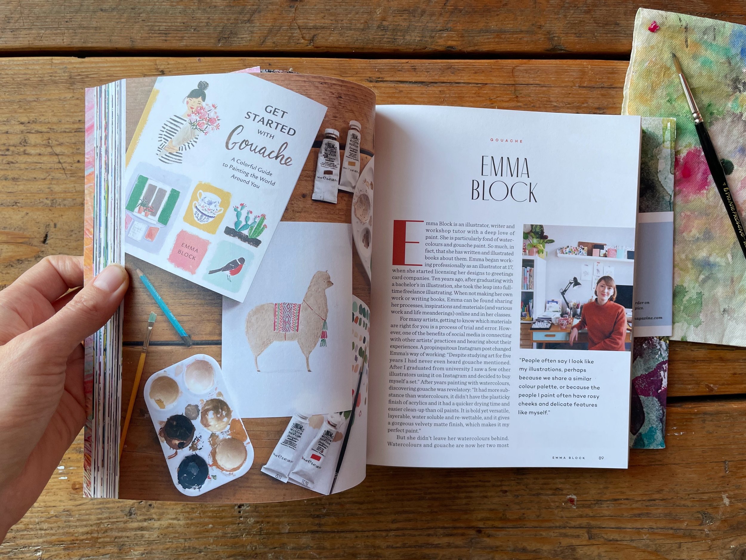
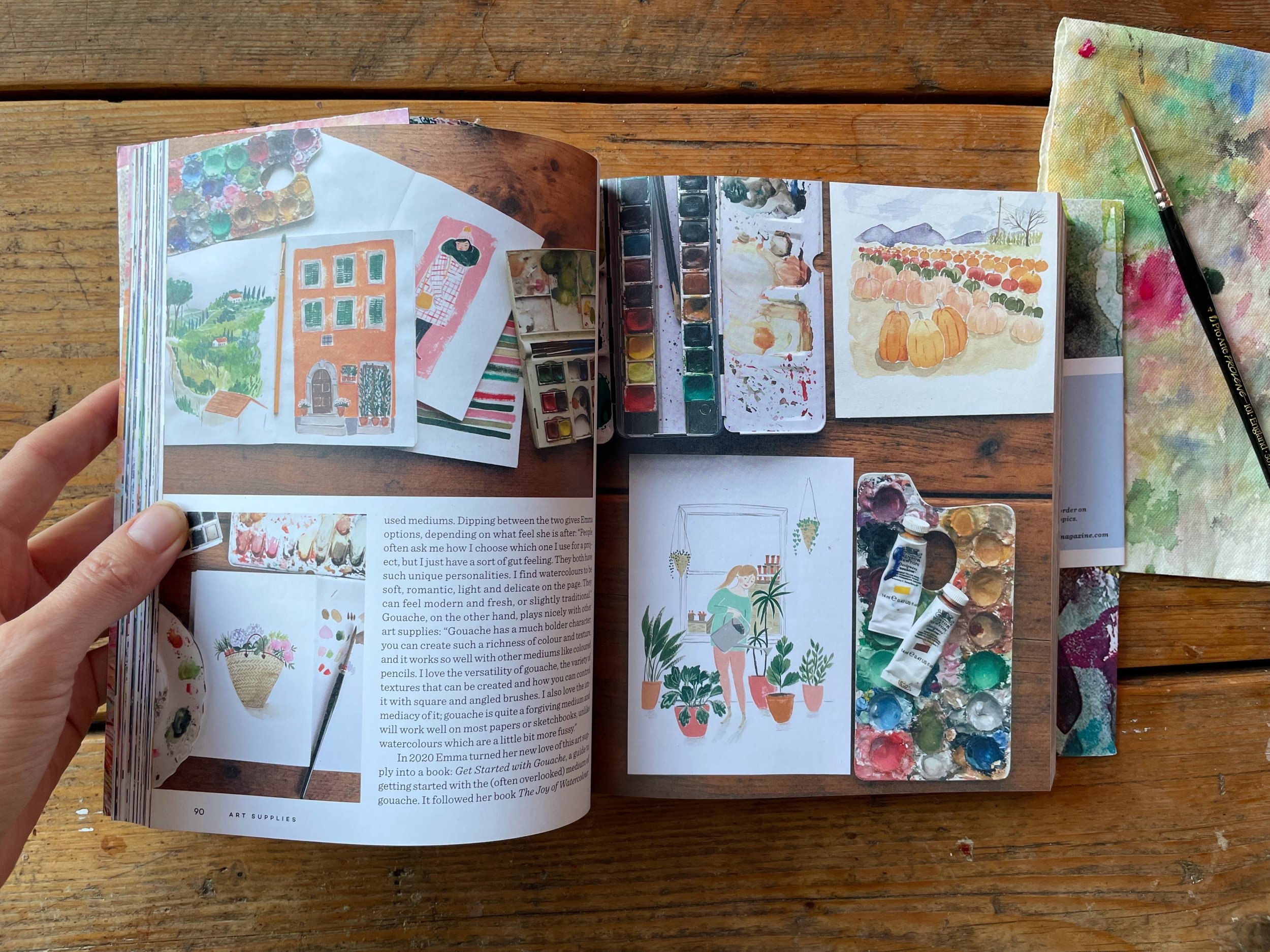
My work has been featured in the beautiful new book Art Supplies, by Uppercase magazine. If you haven’t heard of them, Uppercase produce beautiful magazines and books focused on arts and crafts. This encyclopedia is packed with interviews from artists and artisans who are all united by a deep love of art materials. The photography in the book is just gorgeous, so many luscious colours and textures! It’s such an honour to be included. I love that this close-up photo of my crusty and trusty enamel paint palette has an entire page to itself. Here is a little excerpt from the interview with me. You can buy a copy here.

Here is a little excerpt from the interview with me.
‘Dipping between the two gives Emma options, depending on what feel she is after: "People often ask me how I choose which one I use for a project, but I just have a sort of gut feeling. They both have such unique personalities. I find watercolours to be soft, romantic, light and delicate on the page. They can feel modern and fresh, or slightly traditional."
Gouache, on the other hand, plays nicely with other art supplies: “Gouache has a much bolder character; you can create such a richness of colour and texture, and it works so well with other mediums like coloured pencils. I love the versatility of gouache, the variety of textures that can be created and how you can control it with square and angled brushes. I also love the immediacy of it; gouache is quite a forgiving medium and will work well on most papers or sketchbooks, unlike watercolours which are a little bit more fussy.”’